Payflow Inc.
FinTech
UI/UX, Development
10 weeks
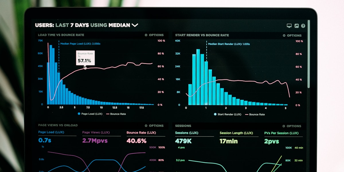
A dashboard users were avoiding
Payflow's payment analytics dashboard had grown organically over five years, accumulating dense tables, inconsistent navigation and confusing terminology. Internal data showed only 22% of users opened the dashboard more than once a month — most relied on exported spreadsheets instead.
Our approachResearch-led redesign, shipped in phases
We began with 14 user interviews and a full audit of support tickets to identify the top friction points. From there, we restructured the information architecture around three core workflows: monitoring, reconciliation and reporting.
Rather than a full rebuild, we shipped the new dashboard in three phases — each validated with a beta group of 40 users before wider rollout, minimizing disruption to daily operations.
 The result
A dashboard people actually use
Within three months of full rollout, weekly active usage of the dashboard rose sharply and support tickets related to reporting confusion dropped significantly. The new design system also became the foundation for Payflow's mobile app redesign, completed by their internal team six months later.
"Nexora didn't just make it prettier — they fundamentally rethought how our users work with data. The phased rollout meant zero disruption to our team."